X-mas 2024 Illustration
Created: December 29, 2024
Last edit: December 30, 2024
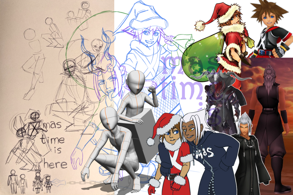
Yes, I do think I'm funny, which is why I decided to redraw an image I made 11 years ago. And, like always, I can't do a 1-to-1 redraw because I crave new experiences. So I decided to lean into the season and add a bit of Krampus↗ to Xehanort. I also took this opportunity to learn how to use the poseable 3D models in Clip Studio Paint↗. It was something I could do while I was away from my tablet.

I already knew I wanted Sora in the basket, but it took me a few scribbles to figure out what to do with Xehanort's legs. I didn't want to cut the figure short because I wanted the image to be able to stand on its own. I kept visualizing it as a Christmas card.
I did enjoy fiddling with CSP's poseable models! The flexibility in the height and mass is neat. It's also much easier to visualize figures interacting than what I've been doing up until now: my very best with myself and the camera on my laptop. If I was unable to find a satisfactory reference online, I just did it myself, making my best guess as to what's enough space for another body. Though, for this year's Halloween image, I was able to use my dress form as a stand-in.

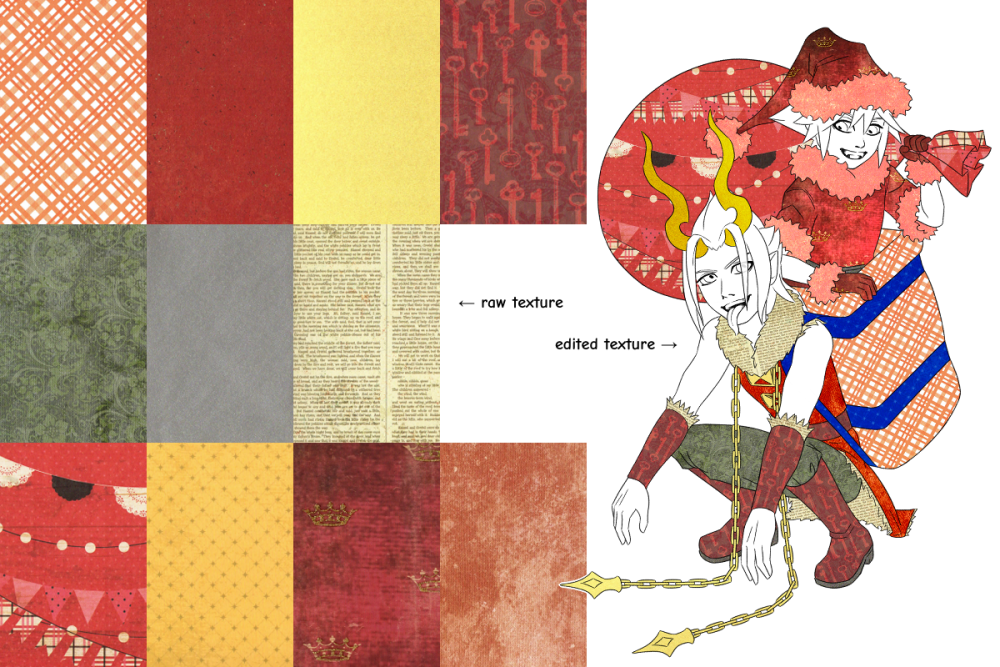
After I pulled my printer off the shelf I had a moment of panic that I'd forgotten where I put the cords (it had been a while since I used the thing). But do not worry! Past me makes rational choices and they were in my desk drawer behind the printer paper. Then I began shifting through my small hoard of scrapbook paper.
In the image above you can see what I settled on and scanned in. I didn't pay much attention to specific colors, instead focusing on tone and texture. You can see within the lineart the textures after they were edited for the image. Some were more heavily edited than others.

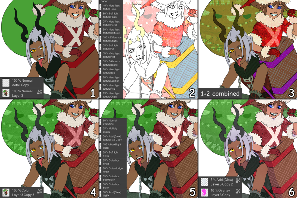
Alright, onion time. Let's get into the color layers. Above, in panel one, are the flats plus a layer named "detail", which is the X on Sora's tunic. The background is white here, but the colors were laid down on a medium grey background. Panel two is the "paper" folder, showing the textures in their final blending modes and opacities. Panel three is what the layers shown in panels one and two look like combined.
Panel four is a duplication of the flats that overlays everything in a Color blending mode. All the layers mentioned so far were on as I did the edits to the "paper" layers. In panel five you can see the effects for the untextured areas, plus the shading and supplemental layers for the X. Panel six is the final touch: overlays to help unify and brighten the colors.

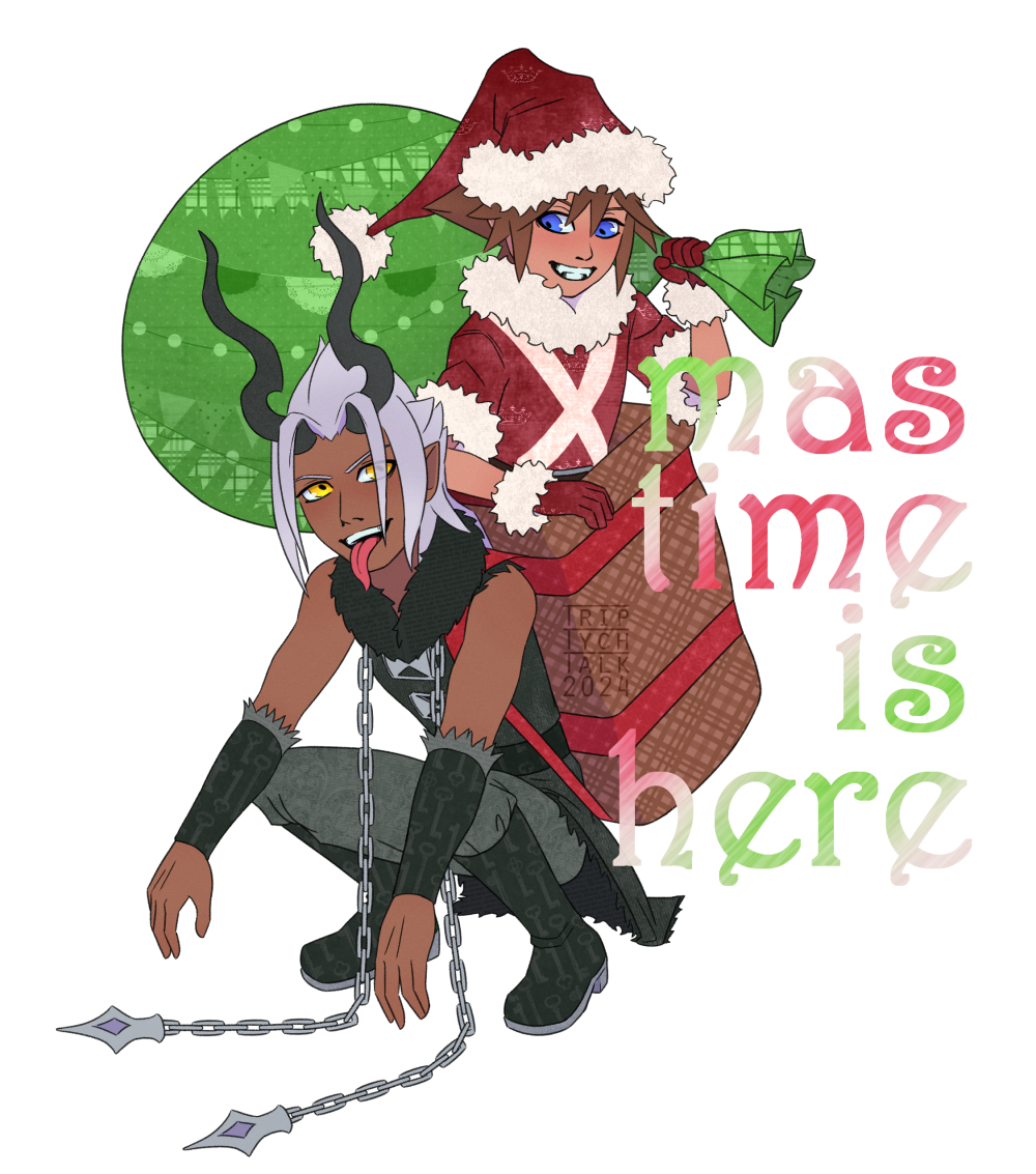
I will admit the final text is half-hearted, but at this point I was a few days past Christmas and wanted to be done. It's several layers of effects and the texture is a noise render sent through motion blur. My original intention was metallic, but it ended up looking a bit more like hard candy, which is suitable enough.
The final image is transparent, so if you're in light mode, it may be worth toggling to dark mode to properly see the text.
Textless version of the above illustration can be found in the KH Gallery.
Overall, I'm pretty satisfied with the final piece. The paper textures added exactly the visual interest I wanted. I may end up scanning more to use in future pieces - I have more than enough to choose from.